Company
LEVIS STRAUSS INC
Project Overview
Levi's had a problem, their website was spread across three independent websites; mobile, tablet and desktop. Our challenge was to replace this $10 Billion company's entire e-commerce presence with a single, beautiful, responsive website.
In addition to this work, I undertook numerous other projects doing robust A/B tests in the checkout funnel and other places adding an additional $4M of revenue per quarter to Levi's bottom line.
Roles
UI/UX Design
UX Research
2nd Hire in a Team of Five
Tech
Sketch
Hybris
Responsive
Duration
16 Months
Responsibilities
Hired as the second designer the team ultimately grew to 6 designers where we were each responsible for a portion of the website. My sections included the Product Page which comprises 60% of the website and parts of the shopping bag and checkout flow. All work below the headers is mine.
.png)
%20(1).png)
.png)
DISCOVERY PHASE
COMPETITIVE RESEARCH
Competitive analysis & breakpoint research
Significant research was done to figure out how many breakpoints we wanted and what would be the best grid to use. This would be the foundation of the entire brand new website. Since we are mobile first, we started by researching the mobile sites of other e-commerce stores.

DEFINE PHASE
BREAKPOINTS
We chose to design mobile first at the 320px width since a substantial amount of customers still used older phones.
We created a 12 column grid based on Bootstrap 3.3. We designed all screens at the smallest (s) breakpoint and also mocked up screens showing the largest side of the breakpoint. This showed what components were pinned where and which ones should grow and stretch.
.png)
.png)

Small
320px wide is an iPhone 5 as the Levi's site sees enough of this traffic to justify designing at this small of a size.
Medium
This included all things tablets and iPads. If you hold your tablet vertically you will see the mobile website, and if you flip it horizontally it will switch over to the desktop website. We chose to do this as the Small breakpoint hides some of the functionality, whereas the Large one moves the navigation from a hamburger menu into a top bar navigation.
Large
The website will stop stretching and just stay centered when it hits 1440px wide. Backgrounds to the header, footer and some marketing images have the possibility to stretch infinitely across the entire viewport.

OUR GRID
Collectively the team discussed and decided on these breakpoints and container parameters.
If I was able to do it again I would make the columns in the smallest size breakpoint larger. Although they grow as you get to the larger sizes, it doesn't allow for enough flexibility within the smallest breakpoint. To fix this the gutters should have been made smaller. On the up side, the current design does allow for consistency of gutter sizes across all breakpoints, which adds aesthetic consistency.


DESIGN PHASE
MOBILE FIRST
PRODUCT PAGE (PDP)
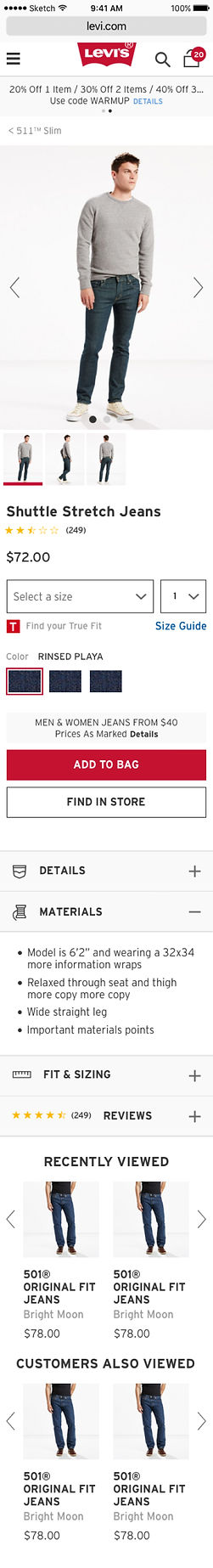
Start with the smallest size at 320px wide and build up from there. I was responsible for the PDP portion of the website; this composes 60% of their online presence. The PDP includes multiple variations including reviews, errors, swatch expand, out of stock status, image variations including video and more. It also includes flows stemming from the PDP including Find in store.
.jpg)
Breadcrumb added for quick navigation


Arrow added to encourage interaction, swipe functionality also works
Thumbnail solution had to fit at least 8
Elegant indicator of active thumbnail

Business wanted to encourage foot traffic so this option was elevated as a CTA
Detail blocks were condensed to elevate viewing of 'Recently Viewed' which generates significant revenue

Dynamic stackable blocks can be tested to add most profitable module
VALIDATE PHASE
DOES IT FLOW SMOOTHLY?
Validation was done with over 15 stakeholders from different departments at Levi's including Brand who is responsible for all photography and Marketing who is responsible for email and digital communication to the user.
PHOTO NAVIGATION
Interactions were animated in principle and built to give developers clarity. Here's a sample of a quick one.

WE'RE RESPONSIVE!
Blocks will resize and re-stack based on the breakpoint.
NEXT STEPS
Go Global
This website first went live for the USA, but was also designed to be used as a template for other websites around the world.
Next....Europe.