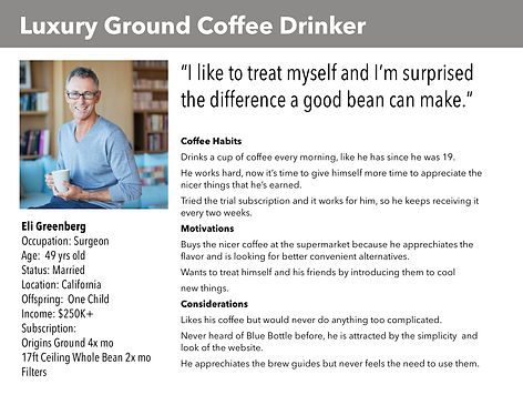
Company
BLUE BOTTLE COFFEE
Project Overview
Blue Bottle Coffee added ground coffee to their product offering. This broke their existing subscription sign-up flow and required a new wizard.
This was a fast exploration to expose challenges Blue Bottle would face and to outline an MVP for launch.
I worked on this project while at the agency Design Equation, Blue Bottle ultimately they built this flow with few modifications.
Roles
UI/UX Design
UX Research
Tech
Sketch
Principle
Invision
Responsibilities
The designs and illustrations were designed by me and adapted for mobile by my teammate. We shared research duties.
.png)
.png)
THE STORY OF THE WIZARD
Update and Improve
A substantial portion of Blue Bottle's revenue came from their subscription customers. Blue Bottle wanted to mimic the success of their whole bean subscriptions with their new ground coffee product. While revamping the subscription flow to accommodate this new product, Blue Bottle wanted us to improve the wizard check out funnel where possible.
DOUBLE DIAMOND
PROCESS
Use the Discovery phase to do research and expand your ideas and options, then Define what is important. Design your solution exploring many options that will solve the problem. Finally, Validate your solution and launch a clear and concise answer to the problem.
.png)
DISCOVERY PHASE
WHY DO CUSTOMERS LEAVE THE FUNNEL?
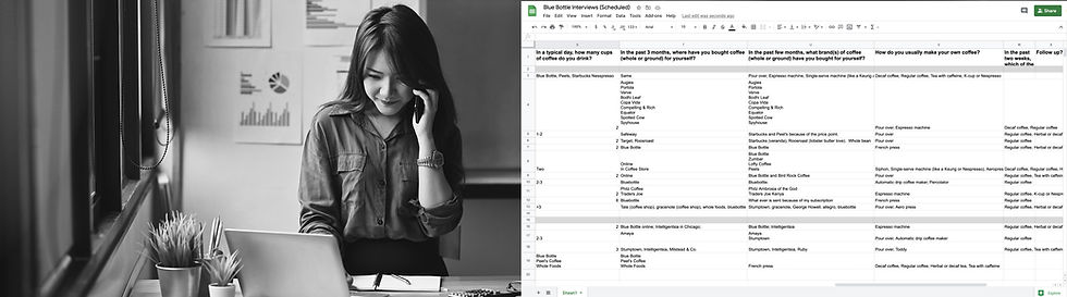
27 Phone Interviews over 2 Days
After customers submitted a survey they qualified for $100 of Blue Bottle coffee if they did a phone interview with us, we were overwhelmed with responses and put together a well rounded group of people who were happily either subscribed, cancelled their subscription, or never subscribed in the first place.
DEFINE PHASE
CUSTOMERS VALUE FLAVOR AND EASE
14 Hours of Interviews Later
We had a lot of information about what the Customer valued most, where their pain points lived and why they either cancelled their subscription or never signed up in the first place. Before we start using this information for sketches we wanted to identify who the user was and what each group absolutely needed.
In addition to flavor, we found that users wanted ease of use with the actual subscription. They wanted to know they can manage subscription after it's purchased.
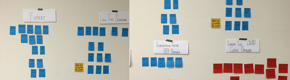
UNIQUE NEEDS
Can You Solve for Both?
Understanding the customer lets us index what they want, and then prioritize what they need. This process allowed us to identify what is most important, and therefore what should come first in the flow.
Needs More Flavor Details

Needs More Help
THE PROBLEM
CONSUMERS DON'T KNOW HOW MANY BEANS THEY CONSUME
This is the Crux of the Subscriber's Problem
How many beans do you order? Most people have never really thought about this, they pick up more coffee beans when they get low. However when you're signing up for a subscription you need to quantify exactly how many beans you want and how often.
Luckily, Blue Bottle has a formula, so if you tell them how much coffee you drink, they can tell you how much coffee to order.

DESIGN PHASE
ADD THE
NEW PRODUCT
Update Architecture
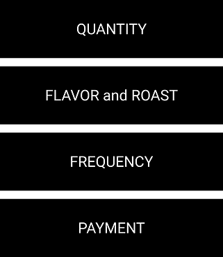
We need to redesign the architecture of the wizard to accommodate the ground bean product. The new ground coffee product broke the last flow since we need additional information for the new flow. This information includes the bean, type of grind and if you're brewing for one.
Bean - Whole bean coffee or ground coffee
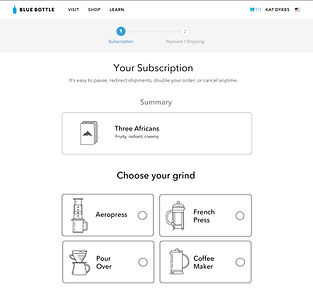
Grind - French press, coffee maker, pour over or Aeropress
Volume of packet - one or two servings per packet
Old Architecture
.png)
New Architecture - With Ground
Why Make These Changes
.png)
The fun part of ordering new coffee is picking and exploring new flavors, so it was important to me to engage with the customer first.
I struggled with where to put the Bean vs Ground choice. We didn't want to hide flavors, or bore the user, so we didn't want to put it first, however we needed to know immediately in order to ask the correct follow up questions.
Unique step for the ground product.
Unique step for the ground product.
Unique step for the ground product.
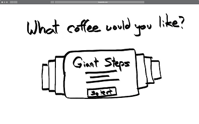
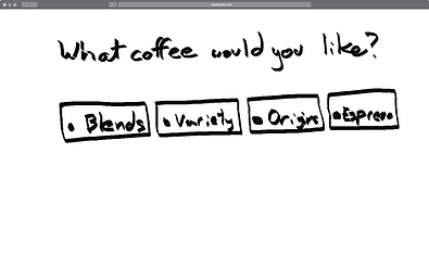
RAPID SKETCH EXPLORATION
Enable users to 1. Sort flavors 2. Pick flavors
3. Pick whole or ground beans
01.
User Feedback
Feedback
Slow experience, but very pretty. No sorting here.
02.
Feedback
Focus on sorting first.
User Feedback
03.
Feedback
Easier to select and more intuitive. CTA is the circle.

04.

Feedback
CTA more obvious and still easy to select
05.

Feedback
Combined wizard steps one and two together which shows the fun coffee flavors faster.
06.
User Feedback

Feedback
Playing more with the idea of combining one and two.
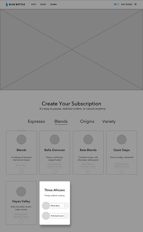
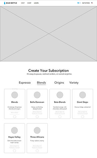
WIZARD STEP ONE
1. Sort Coffee 2. Pick Flavor

3. Pick Whole or Ground
WIZARD FLOW
1. Pick Flavor 2. Pick Bean
3. Pick Grind

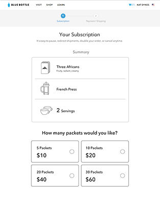
4. Pick Volume of Packet

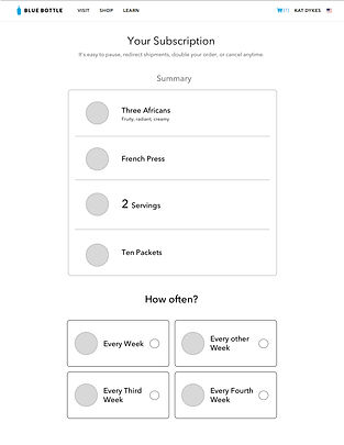
5. Pick Quantity of Packets
6. Pick Frequency of Delivery
7. Review
VALIDATE PHASE
USABILITY TESTING
Users are Confused
I wireframed a basic flow, immediately users started to have problems.
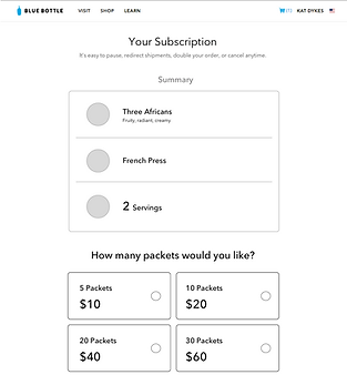
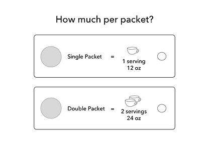
WHAT'S A PACKET?
Users Are Stuck
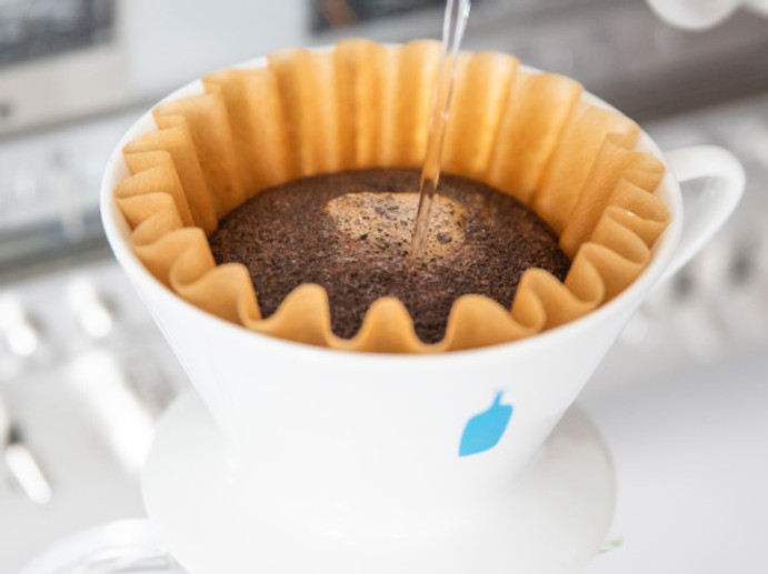
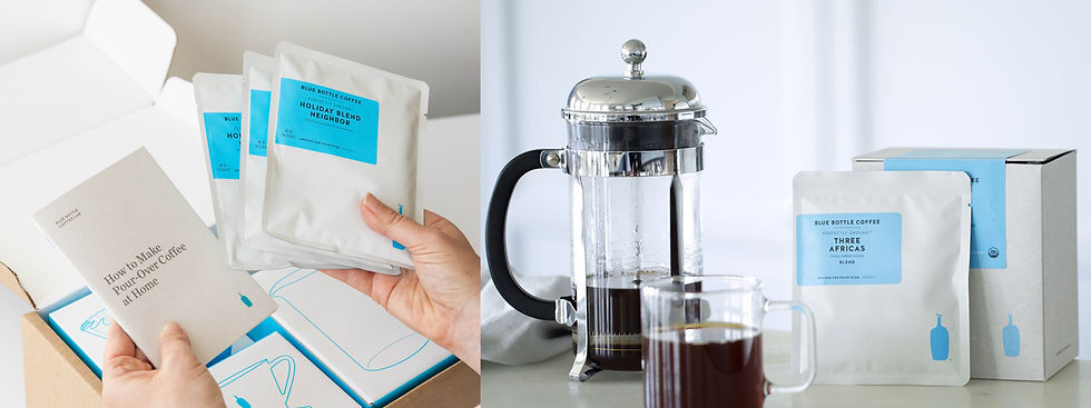
Ground coffee comes in packets with either one or two servings inside. However the concept of a Packet and a Serving proved to be extremely confusing for the user. They never saw the beautiful photos that we did when Blue Bottle introduced us to the product.
Imagine a person who always orders an extra large coffee, do they want one packet or two? Another person makes coffee for themselves and their wife every morning, do they need a double?
4. Pick Volume of Packet
UPDATE THE DESIGN THEN TEST
Multiple Cycles to Find a Solution
Ground coffee comes in packets with either one or two servings inside. This concept of a Packet and a Serving proved to be extremely confusing for the user.
01.

Design Updated
I changed the option from Packet to Serving hoping this would clear up confusion.
Feedback
Some liked it, but the majority of Users didn't have a clear idea how much coffee a serving made. Is it a large coffee? A small coffee? Coffee for one? Or for two? What's a serving?
02.
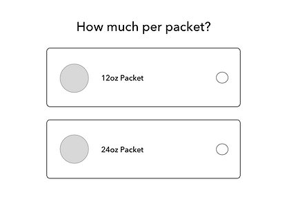
Design Updated
I changed Serving to how many ounces each packet would brew. This was an estimate Blue Bottle roasters came up with.
Feedback
Some liked it, but the majority of Users didn't know how many ounces their favorite coffee mug holds. This option caused even more confusion than the last two, and left the user baffled.
03.
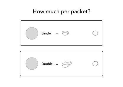
Design Updated
I changed ounces to a drawing of a coffee cup. I was hoping the vagueness of the image would allow the user to fill in the blanks as every users would inevitably tweak their brewing at home anyway.
Feedback
Again, some liked it, but most didn't appreciate the lack of information. Remember we needed to cater to both Personas and one of them is very specifically interested in exact measurements.
04.
Design Updated
The Team and I were out of ideas. We didn't know how else to convey the concept of one serving of coffee. Each attempt made some people happy but others unhappy, so we agreed that we would add as many as possible in order to connect with the Users in each group that did like each option.
Feedback
Overall, it tested well. Everyone seemed to understand the equation and could use all the information together to decide which packet they wanted and move on to the next step with relative ease.
ADDITIONAL IMPROVEMENTS
Add Illustrations for Clarity
When I added the illustration of the coffee cup, users responded with excitement and said it did help them understand more.
If the user is introduced to the concept of the packet right away when they're picking a whole bean or ground coffee...will that help?
Pick Flavor and Bean

UPDATED WIZARD FLOW
1. Pick Flavor 2. Pick Bean
3. Pick Grind
4. Pick Volume of Packet

5. Pick Quantity of Packets
6. Pick Frequency of Delivery
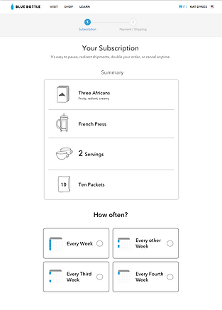
7. Review
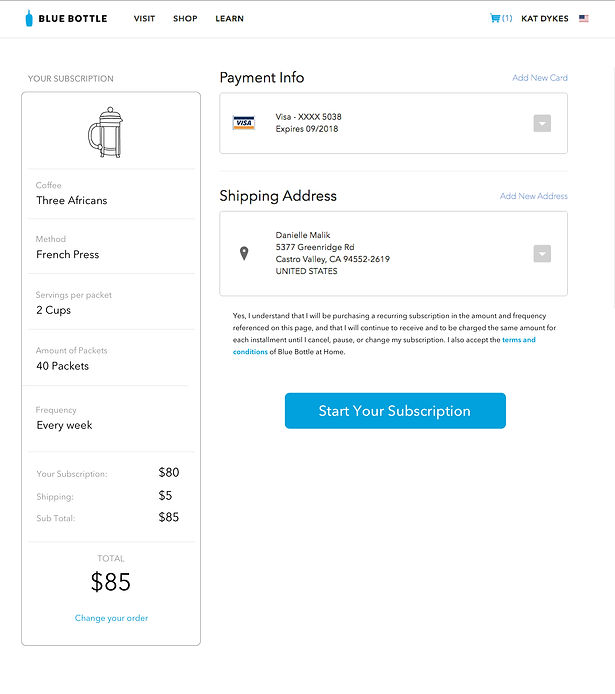
CHECKOUT
Finding Additional Problems
By looking at Google Analytics for the existing subscription I was able to see how many users abandoned the checkout and where they went, which was primarily two places.
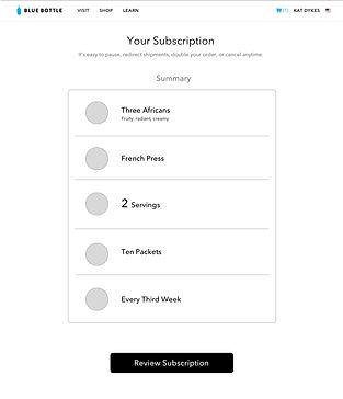
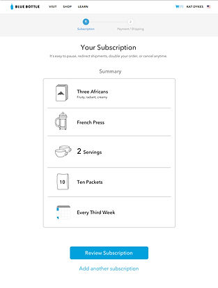
Review and Edit
Most people went back to review their subscription again. They wanted to be 1000% sure they did in fact select everything correctly before they hit that blue CTA button.
Design solution: By adding a summary including each detail, users don't need to leave the page in order to see what they're signing up for.
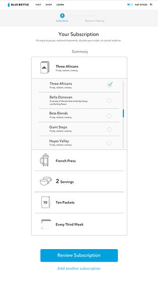
Flavor Exploration
The other largest group of people who left the checkout page went to the coffee flavor product pages. It turns out they wanted to do research, usually they wanted to explore flavor options and make absolutely certain they picked the right one.
Design solution: By adding the ability to edit their subscription while they're building it, or in checkout, the hope is that they won't leave the checkout funnel and start researching outside of the subscription flow.
Hover on Subscription Detail
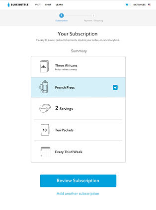
Click to See Options and Select
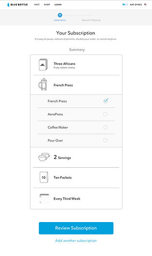
Flavor Details
RESULTS
LAUNCH
Packaging and Handover
This was a three week exploratory agency project for our client Blue Bottle. At the end of the project we packaged and handed over both web and mobile designs. The final mobile designs were done by my co-worker and adapted directly from my designs. Please see my Levi's case study for more mobile and more responsive work I directly designed.
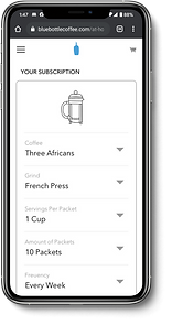
Ultimately Blue Bottle retired their ground coffee product so you can't find it on their website. However, you can see how our research and designs influenced their whole bean coffee subscription flow.
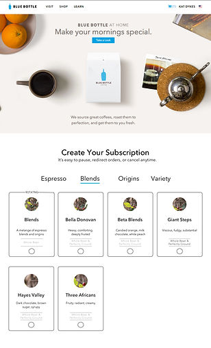
COFFEE SUBSCRIPTIONS AVAILABLE NOW
Click an Image to see the Live Blue Bottle Site
.png)